1st Rendition

A language dropdown was added to promote accessibility and inclusivity, ensuring parents from diverse backgrounds can navigate the site with ease. Placing it on the homepage makes it immediately visible and accessible, meeting users where they first arrive.
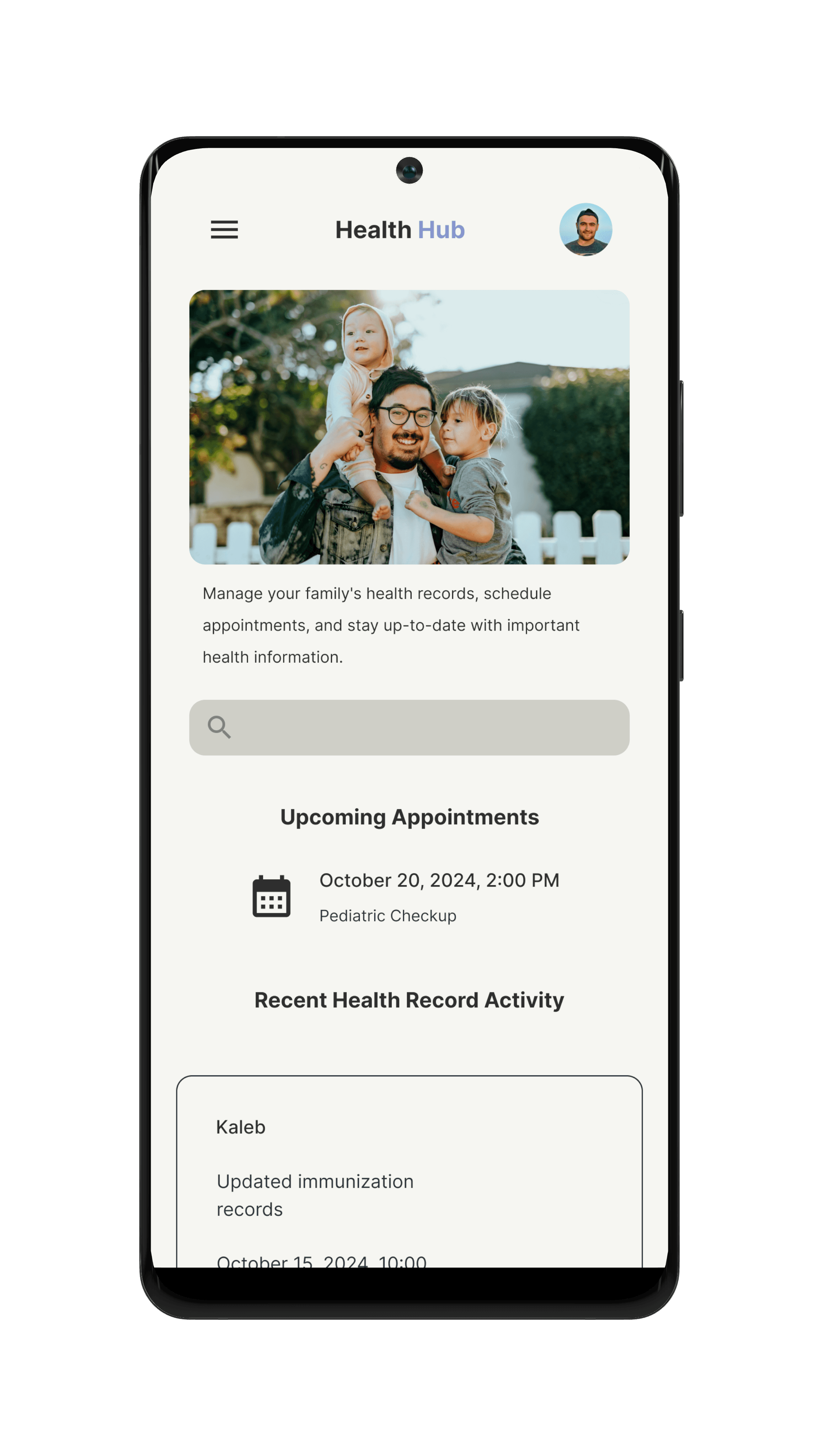
White space was intentionally used to create visual clarity and calm, giving the design a sense of breathability that helps reduce stress when navigating important health information about a child.
Typographic hierarchy was used to separate content by importance, reinforcing a core principle of effective and accessible UI design.
Three uniform buttons were grouped together using consistent size and style to reinforce their shared purpose, applying Gestalt principles of similarity and proximity for a more intuitive and organized user experience.
Design System
HealthHub
Role
Timeline
Team
Product Designer
May 2025 | 2 week sprint
Me/Product designer
Parents shouldn’t have to dig through paperwork or navigate confusing systems just to manage their child’s health. This app was created to simplify that process — providing secure access to medical records, easy printing for school and camp requirements, and gentle reminders for upcoming visits. It’s a tool that meets families where they are, making health management feel more human, accessible, and stress-free.
Prompt
Design a responsive website and mobile app that allows parents to securely manage, track, and print their children's health records for personal, school, or camp use.
Scattering
Medical records are scattered across multiple providers or systems, making them hard to access in one place.
No Reminders
Parents forget when check-ups, vaccinations, or follow-ups are due.
Shuffling
Parents with more than one child struggle to manage separate health timelines.
Inconsistency
Parents want a calm, non-overwhelming interface, especially when dealing with something as important as their child’s health.
Assumed user needs and pain points
Name
Demographic
Goals:
Pain points:
Marcus
Hernandez
41
Associate’s Degree in Information Technology
Philadelphia PA
Married with 3 children
IT Support Specialist
Keep track of all 3 kids vaccination schedules, and health appointments
Have quick access to children's medical records on phone
Use straightforward app with little to no hassle
Finds juggling multiple kid's health info overwhelming and confusing
No good/easy mobile versions of already existing services
Worries about keeping sensitive information secure yet accessible to both parents.
Personas

“Between work and family, I need a simple way to manage my kids’ health stuff without digging through papers or logging into different sites”
Journey map
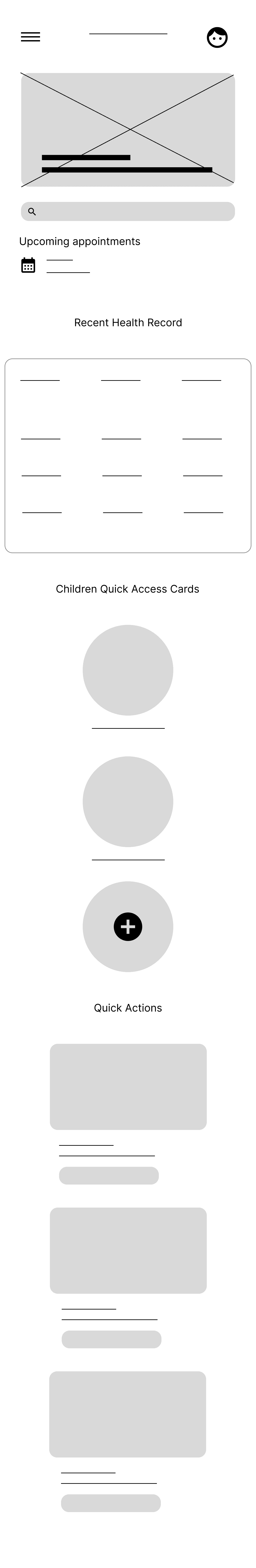
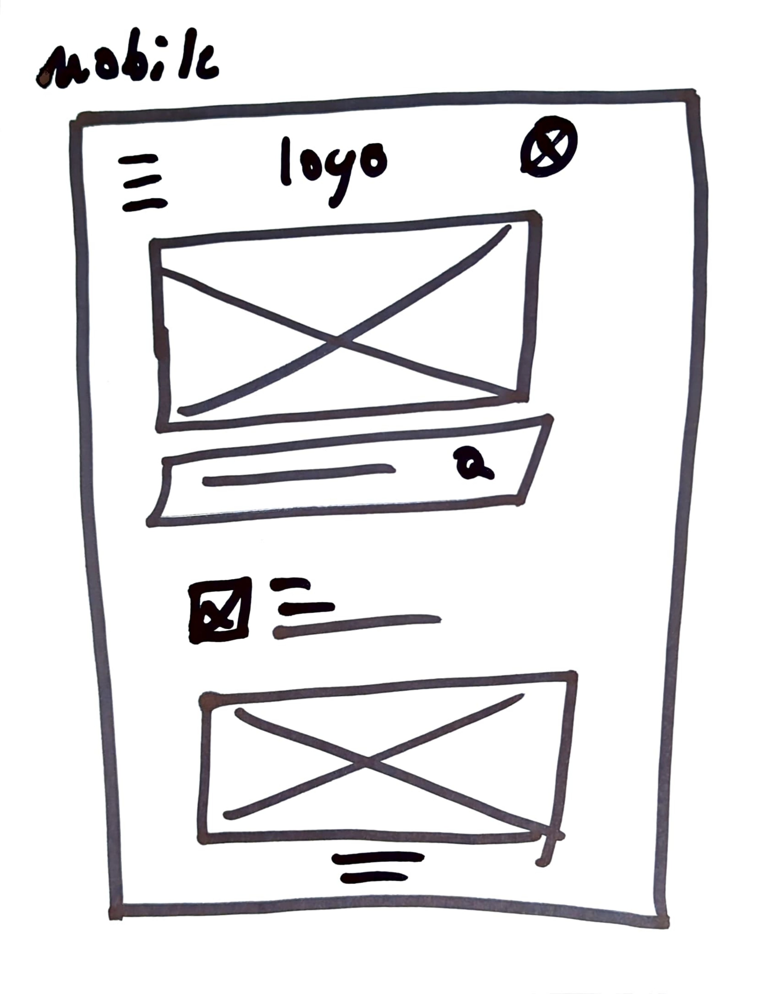
Digital Wireframes (Mobile)
Search bar implemented to assist in navigation
Vertical display of cards allows for more space and breathability
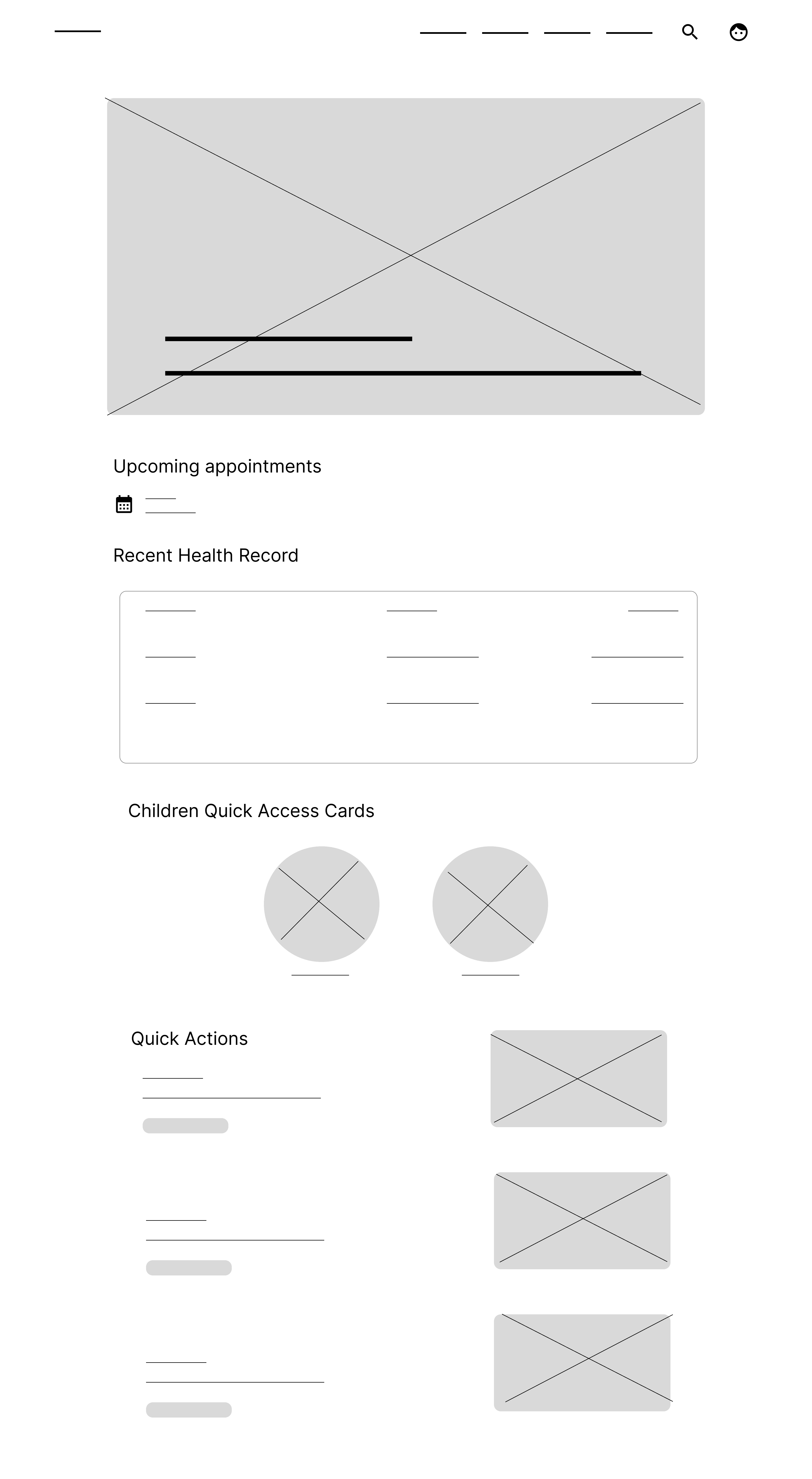
Digital Wireframes (Web)
Upcoming appointments are immediately visible to user
Recent Health Records gives summary of most recent visit
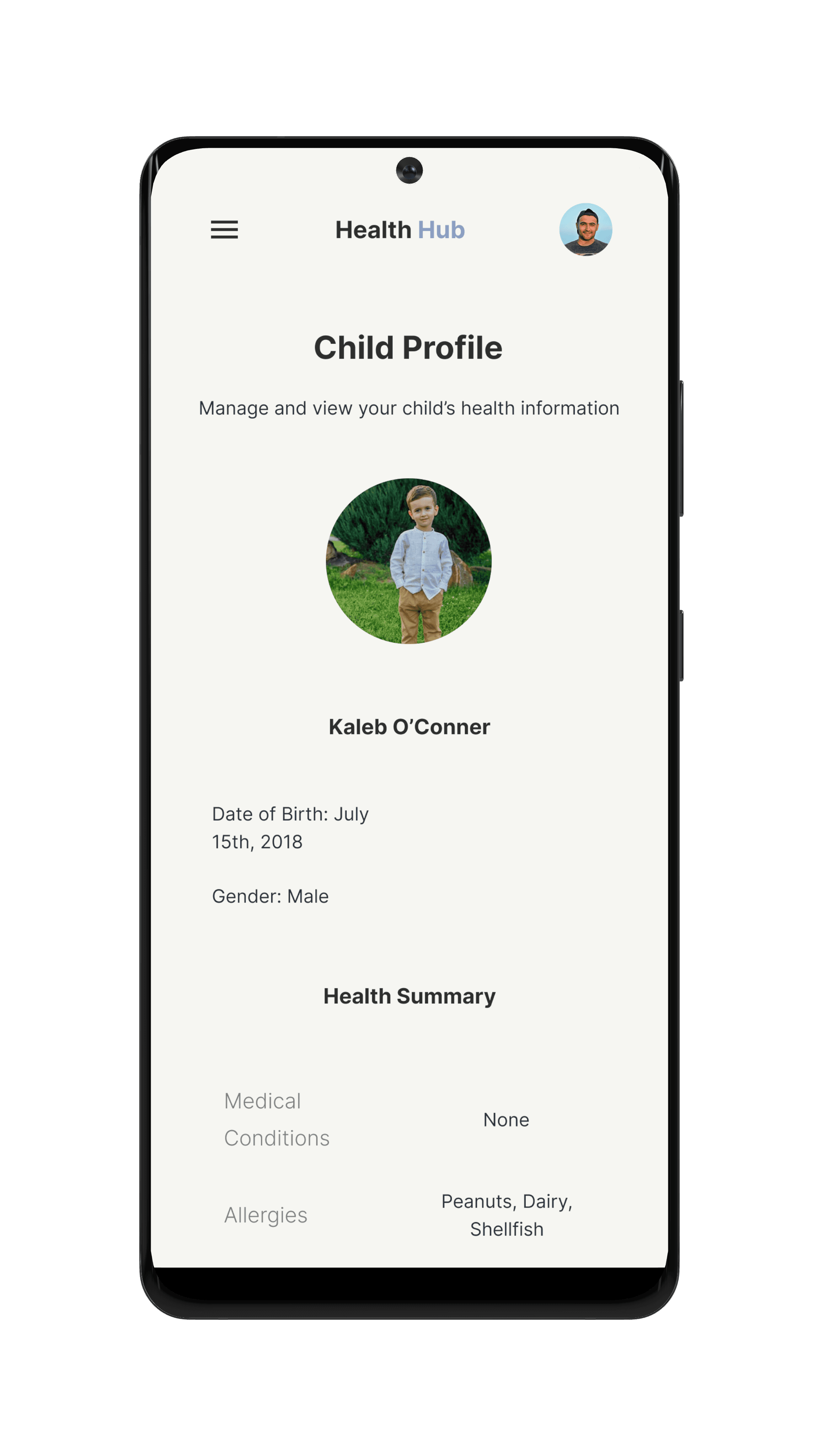
Quick Access Cards allow users to view child profiles immediately
Quick Actions are available, allowing faster navigation

Attributes
Details
Study type
Unmoderated
Participants
5 participants who have children between the ages of 0-17 years of age
A user with a visual impairment
A user with an auditory impairment
Non-native English speakers or bilingual users
Length/Location
Each session will see a time of around 10 min based on prompts
United states, remote (each participant will complete the study within their home)
Tools
Figma Prototype + Zoom / Google Forms
Goals
how easily parents can navigate the app to access key health information like immunizations, medications, and appointments?
Evaluate the clarity and effectiveness of the UI, especially the use of hierarchy, color, and spacing.
Identify any points of confusion or friction in completing core tasks.
Gather emotional and trust-based feedback to see if the app feels secure, calming, and reliable.
Testing Users
Overview
The goal of this moderated usability study was to evaluate how easily users could navigate the website, complete key tasks, and understand its purpose, in order to identify areas for improvement and ensure a smooth, user-centered experience.
Key insights
Key takeaways
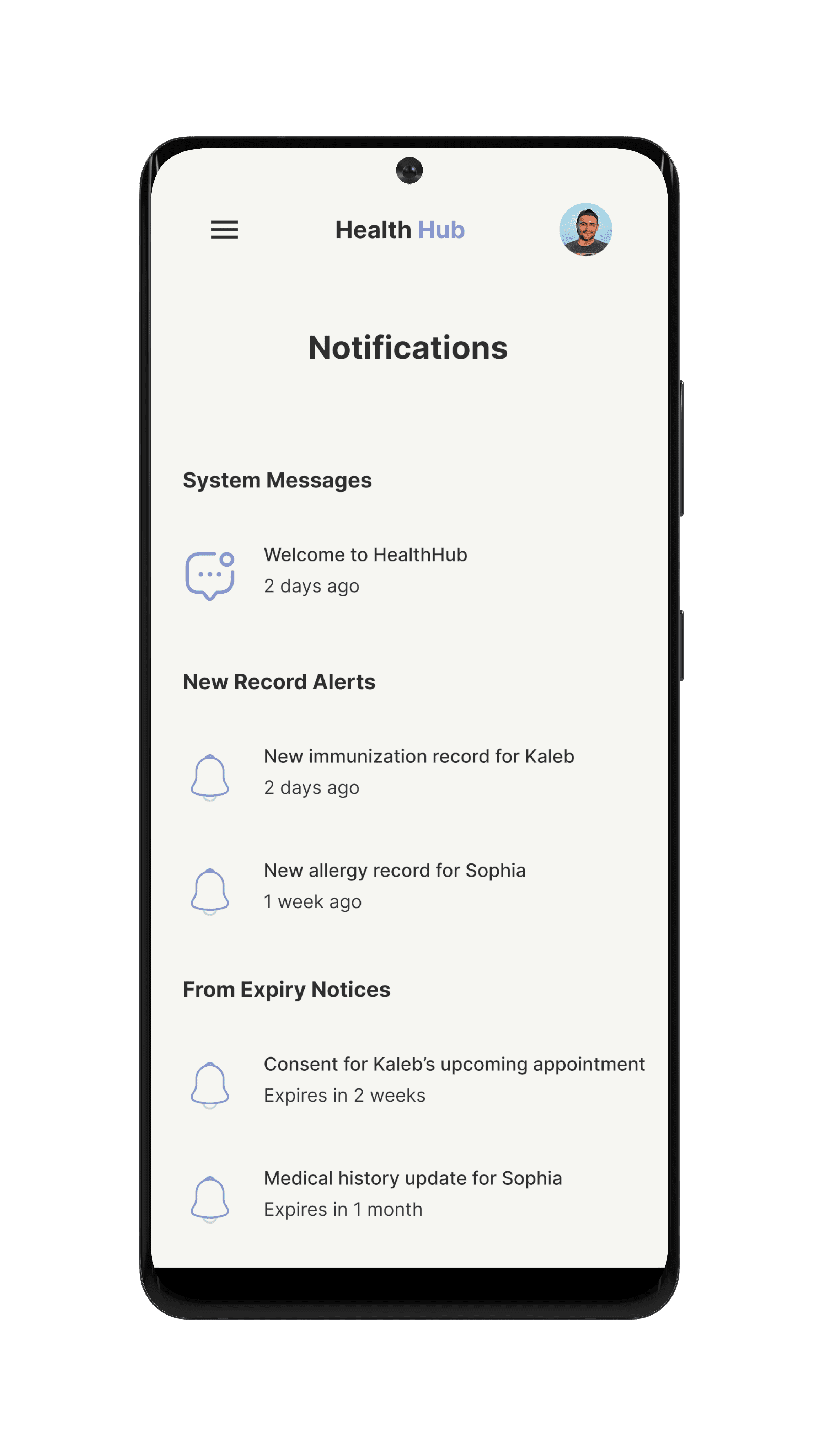
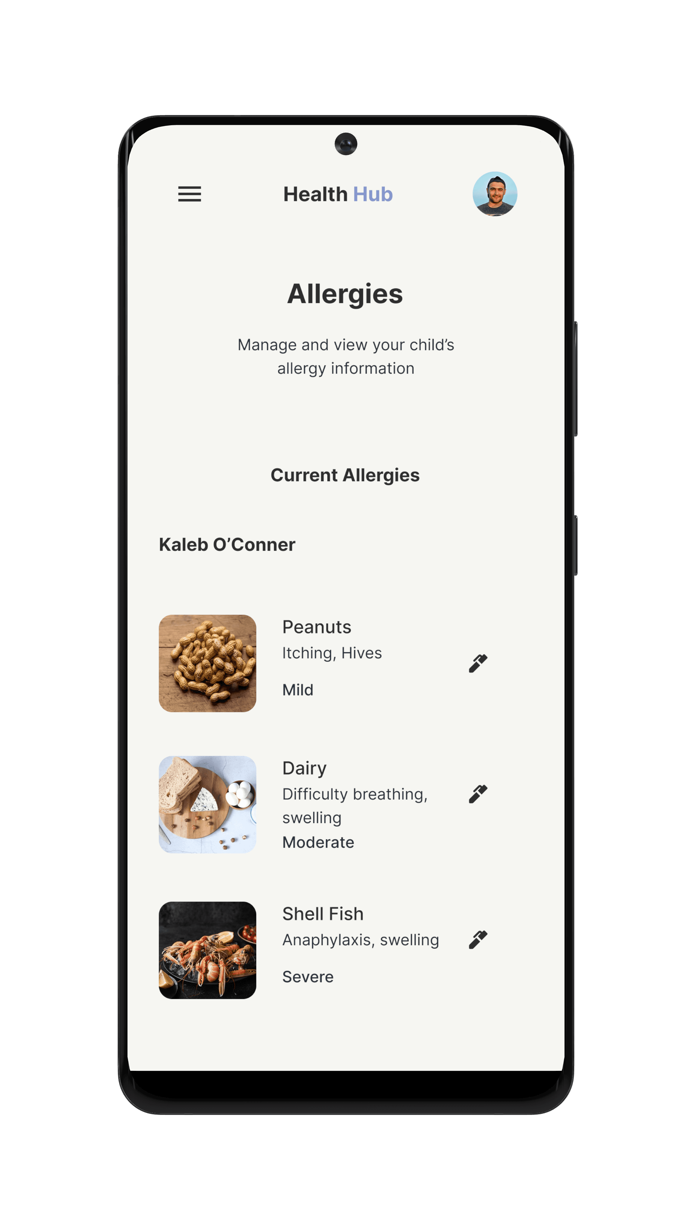
Couldn't locate "Allergies" section
Users found it confusing to locate the "Allergies" section within their child’s medical profile.
Couldn't locate "print" button for documents
Users were unable to find the "Print" button for individual documents even when they were already viewing the correct page.
No main "print" section for all documents
Users struggled to find a centralized location where they could print all documents for transfer purposes.
We will improve the visibility and labeling of the Allergies section by making it a clearly marked tab within each child's health summary.
We will reposition and visually emphasize the Print button so it is consistently placed and clearly associated with each document.
We will introduce a dedicated “Download & Print All” section within the dashboard for quick access to comprehensive record exporting.

Where can we win?
Gaps/ opportunities
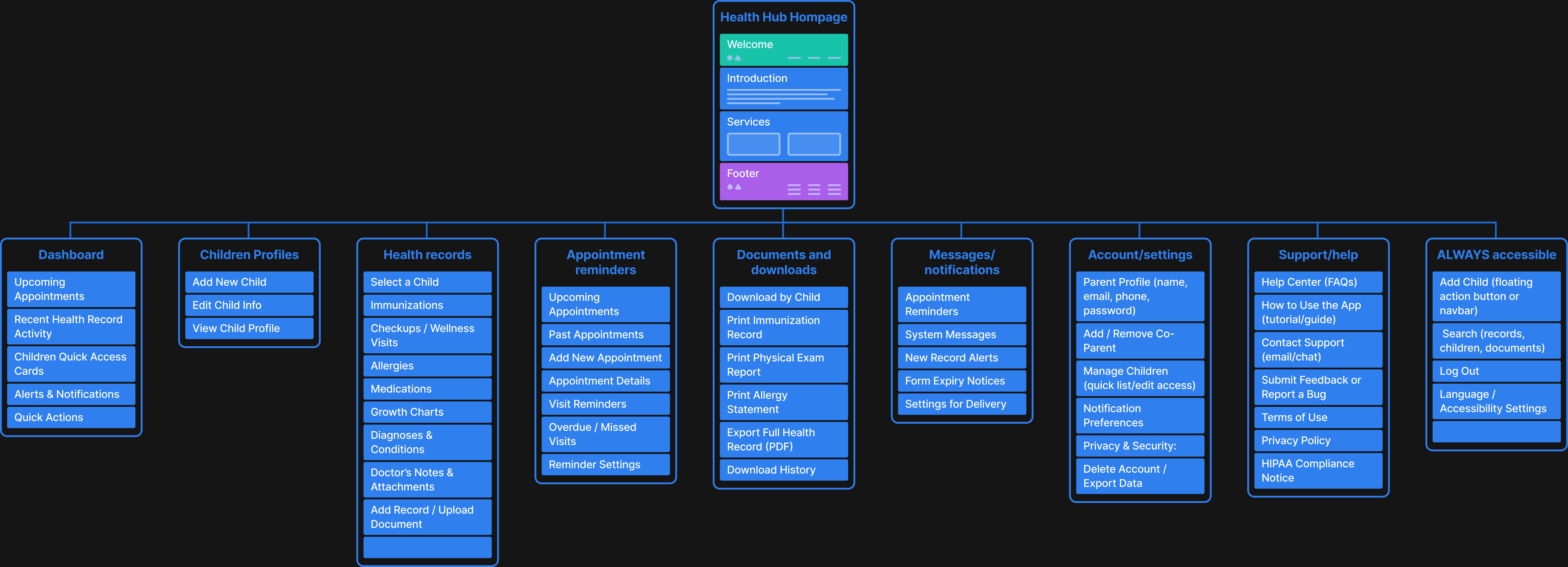
Site Map
Together, the chosen colors create a balanced, soothing visual environment that supports the emotional needs of parents navigating their children's health information. The palette blends warmth, clarity, and professionalism, helping users stay calm, focused, and in control. Psychologically, the soft tones reduce cognitive load and anxiety, promoting a smoother, more positive user experience — especially when dealing with tasks that are often stressful or urgent.
Why This Design?
F6F6F2
This soft, warm white was chosen as the primary background color to create an open, breathable interface. Its subtle cream undertone reduces visual strain and evokes a sense of calm and cleanliness, which is especially important in a health-focused environment. Unlike stark white, pearl white feels more human and approachable — helping parents feel at ease while navigating sensitive information
2E2E2E
Used primarily for text and key interface elements, this soft black offers excellent contrast without the harshness of pure black. It maintains strong readability while contributing to a more refined, less aggressive aesthetic. Psychologically, it reinforces professionalism and trust, which is critical when dealing with something as personal as a child’s health.
8695CD
This cool, muted blue was selected for hover and active states to provide a calm, confident visual cue without overwhelming the user. Blue is often associated with trust, safety, and clarity — making it ideal for interactions involving medical documents and personal information. The softness of this particular shade avoids the clinical coldness of traditional medical blues
Overall, users responded positively to the visual design and layout of the app, noting its clean and intuitive aesthetic. As a result, minimal visual changes were needed. However, feedback highlighted several opportunities to enhance accessibility and usability through adjustments in language and navigation. Key refinements included updating tab labels for greater clarity, repositioning critical sections like Allergies for easier access, and adding in-page download functionality to essential forms. These iterative changes led to a more seamless and user-friendly experience, aligning the product more closely with the needs and expectations of its users.
Lets take a closer look
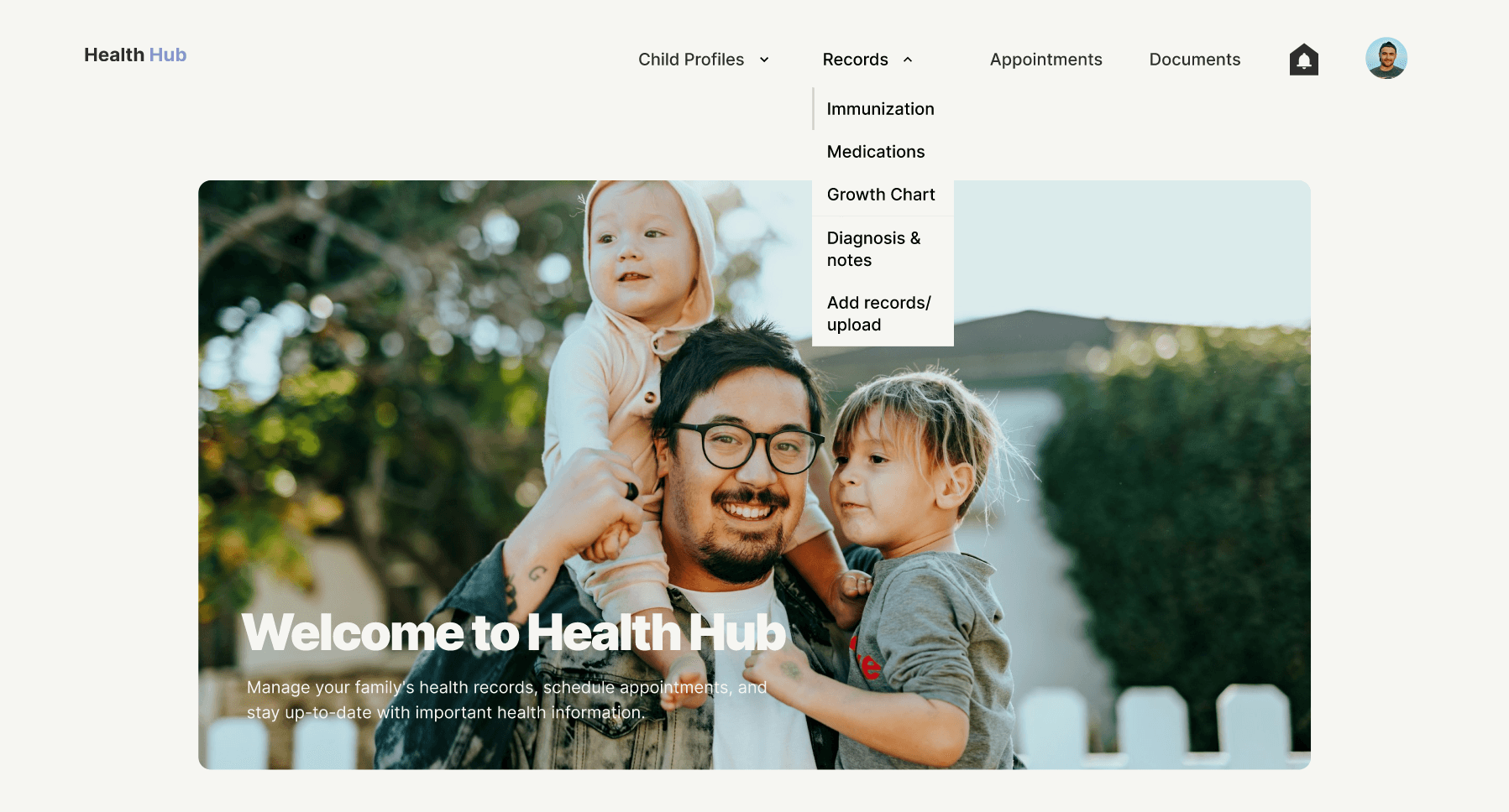
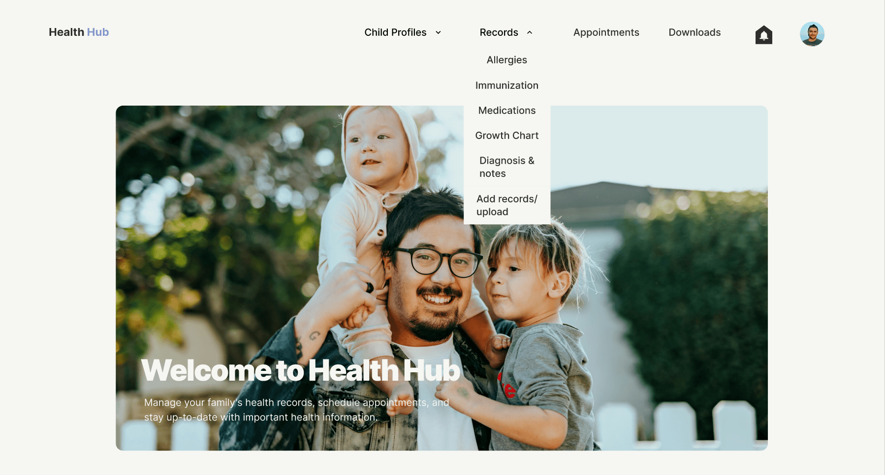
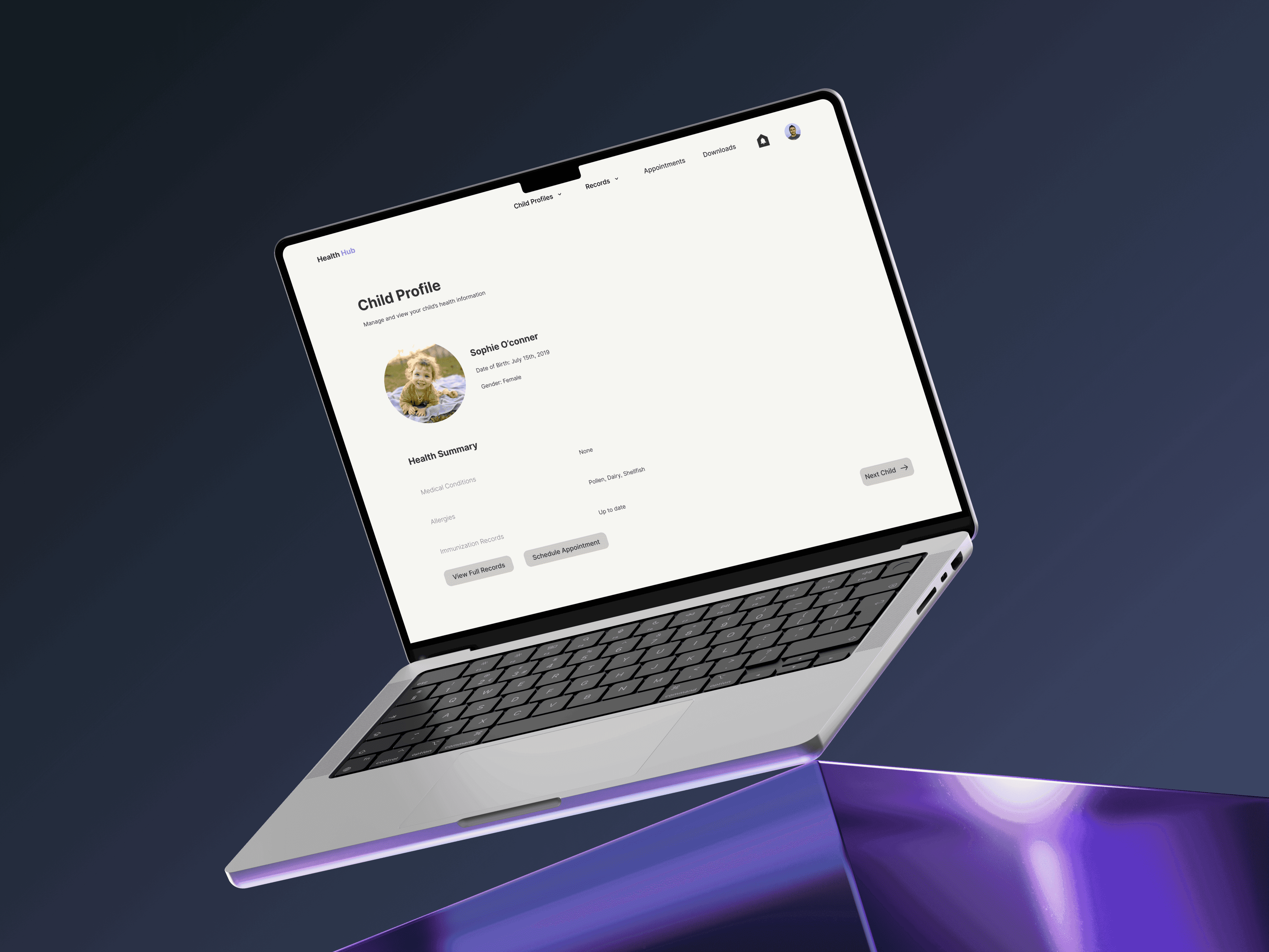
Based on usability testing feedback, I moved the Allergies section from the child’s profile to a dedicated item in the dropdown menu. This improved accessibility by reducing the number of steps parents needed to take to locate important health information.
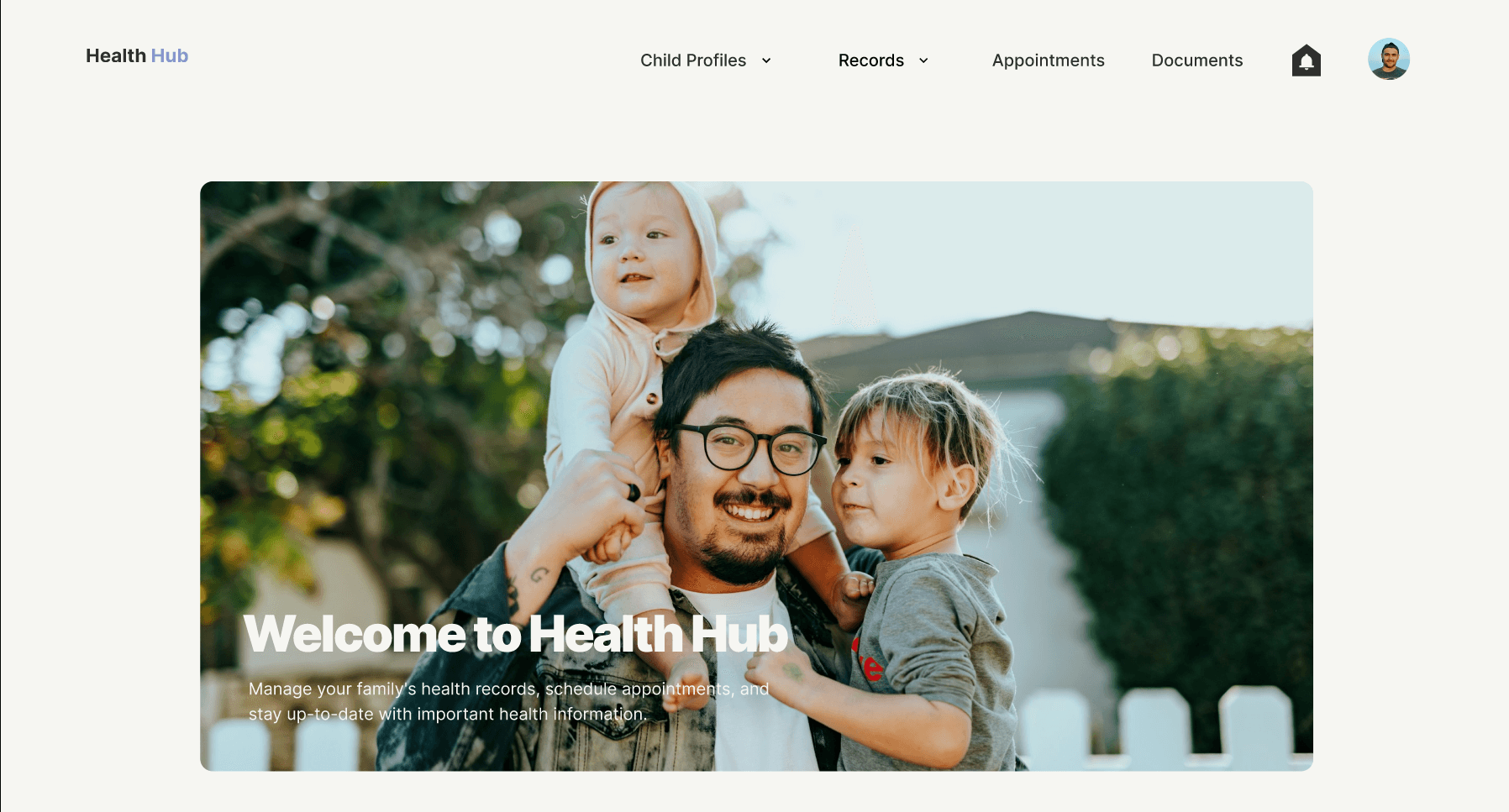

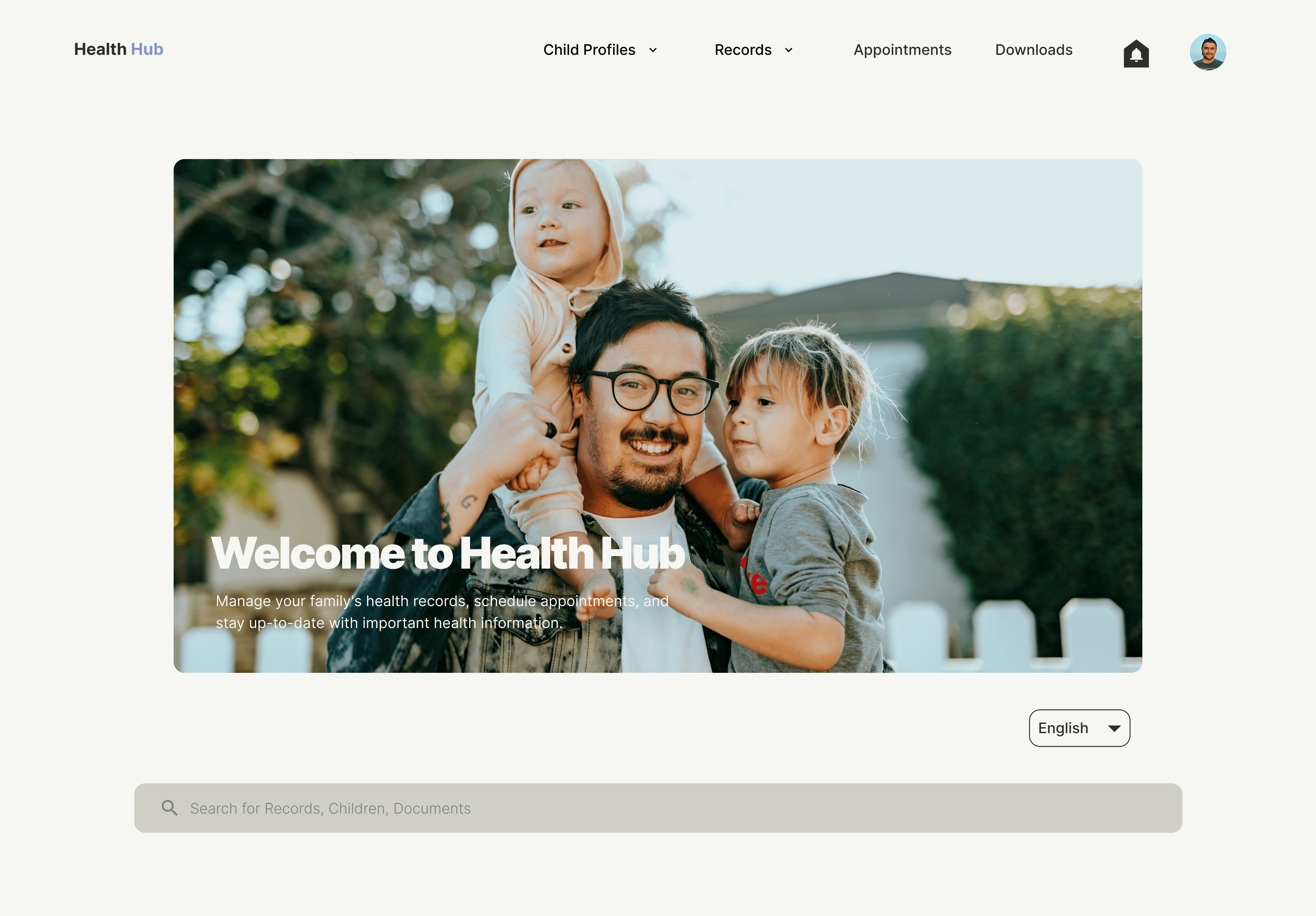
To enhance clarity and support accessibility, I updated the homepage tab label from “Documents” to “Downloads”. This change aligned the language more closely with user expectations, making it immediately clear that the section contained downloadable files.
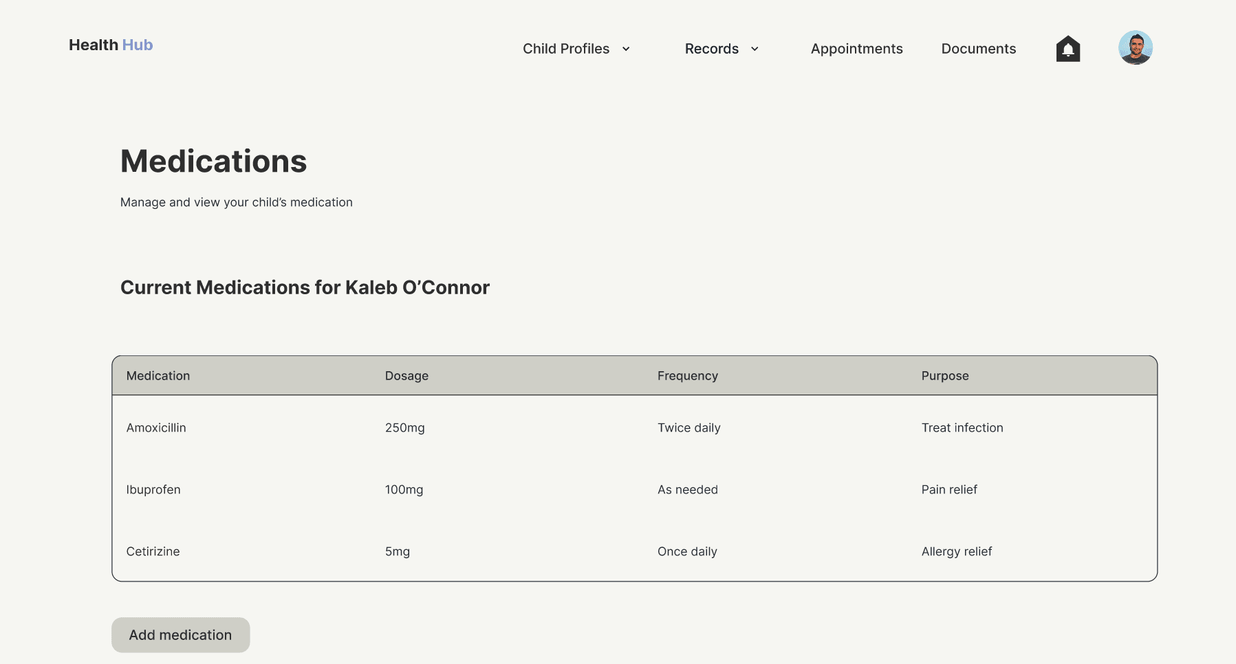
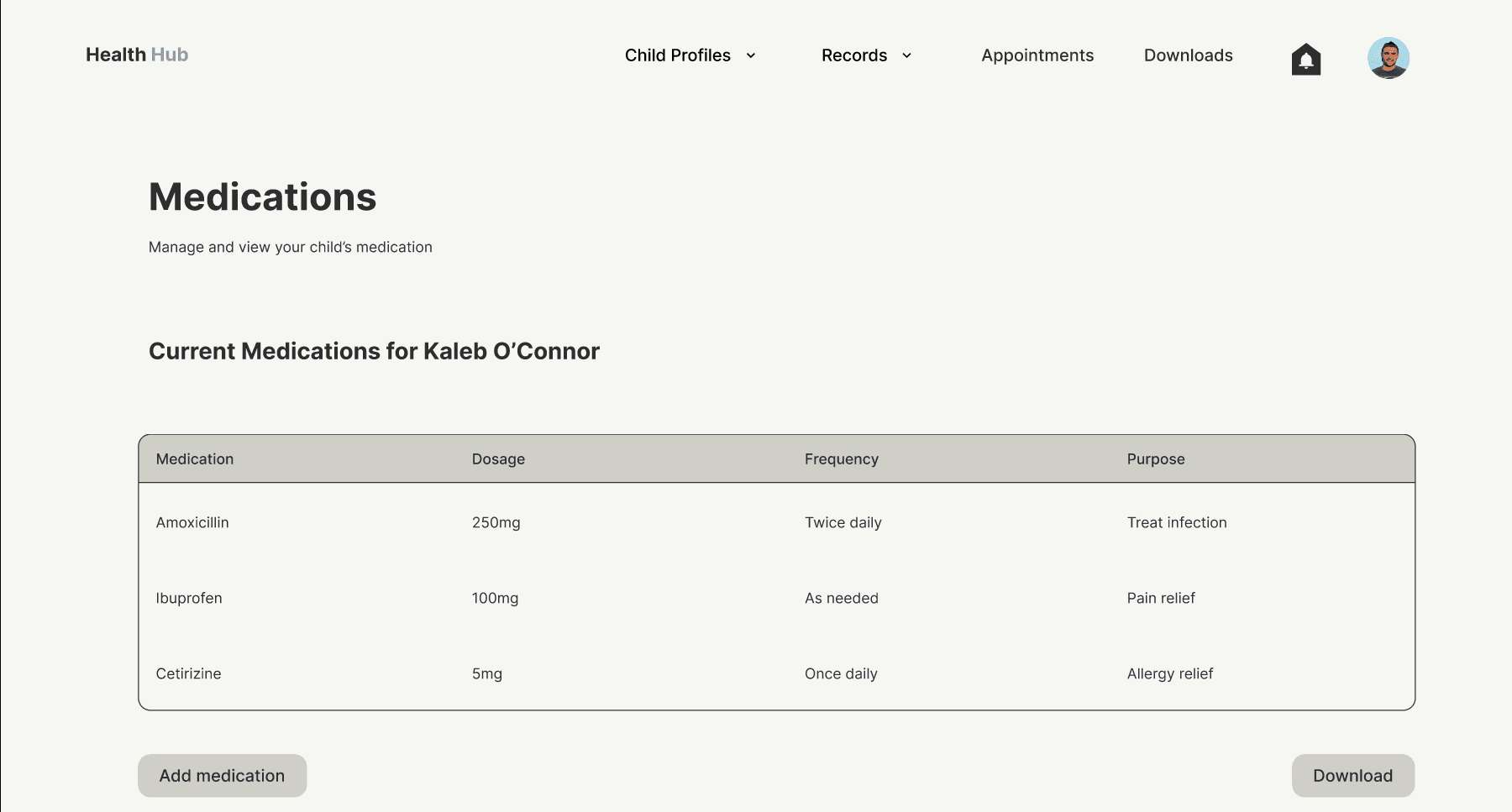
In response to user feedback, I added a Download button to essential forms like Medications. This allowed parents to easily download or print documents without navigating away from the page streamlining access to critical health information and improving overall usability.
What I learned
Reflection
This project deepened my understanding of how critical language is to user experience. I learned that even small wording changes—like renaming a tab from “Documents” to “Downloads”—can reduce confusion and help users navigate more intuitively. Clear, user-friendly language is more than a detail; it's a core part of accessibility.
After observing how users struggled to locate the Allergies section, I realized the importance of designing for visibility. Relocating this section to a more accessible dropdown tab taught me to think beyond what makes sense to the designer and focus instead on what’s immediately usable for the end user.
Implementing a download button directly on key forms like Medications showed me how users value efficiency. I learned how thoughtful micro-interactions like avoiding page switches, can significantly streamline tasks and reduce cognitive load.
One major insight was that strong visual design isn’t always enough. While users appreciated the look and feel of the interface, it was the structural and functional adjustments—based on feedback—that truly improved the experience. This helped me understand the deeper role of UX beyond surface-level polish.
Above all, this project reinforced how essential testing and iteration are. Each usability issue uncovered offered an opportunity to refine the product and sharpen my own design thinking. It reminded me that good design doesn’t happen in isolation—it happens through listening, adapting, and putting users first.
If this project were to continue beyond the scope of the course, I would conduct a second round of usability testing to validate the changes made—such as the updated navigation, download functionality, and improved labeling. Gathering feedback from a broader group of parents with diverse needs would help identify any remaining pain points or accessibility gaps. I would also explore integrating reminders or notifications for upcoming medical tasks, based on early user interest. As I continue building my UX skill set, this project has inspired me to stay user-focused, seek feedback often, and approach future designs with both empathy and adaptability.
Next Steps
Like what you see? Lets talk!
RG DESIGN
Top Competitors
FollowMyHealth
MyChart
FollowMyHealth
MyChart
Competitive analysis
What’s the competition like?
Strengths
Simple, centralized portal for accessing health records
Cross-platform support with mobile apps and web portal
Membership tiers available
Messaging with providers and appointment scheduling features.
Widely used by many healthcare providers across the U.S
Comprehensive patient data including visits, medications, lab results
Offers mobile apps on iOS and Android
Weaknesses
Poor navigation for complex family or multi-child management
Limited support for document downloads or printing
Mobile experience lacks polish and responsiveness
Mobile app can be clunky and unintuitive, especially for parents managing multiple children
Printing and downloading important records can be complicated or hidden
User interface is not particularly modern or family-friendly.
Simplify management of health records for multiple children within a single family dashboard.
Provide quick and easy access to download and share important medical documents
Design a clean, intuitive mobile app tailored for busy parents on the go
Deliver personalized and timely reminders for children’s health appointments and vaccinations
Starting the design
Paper wireframes

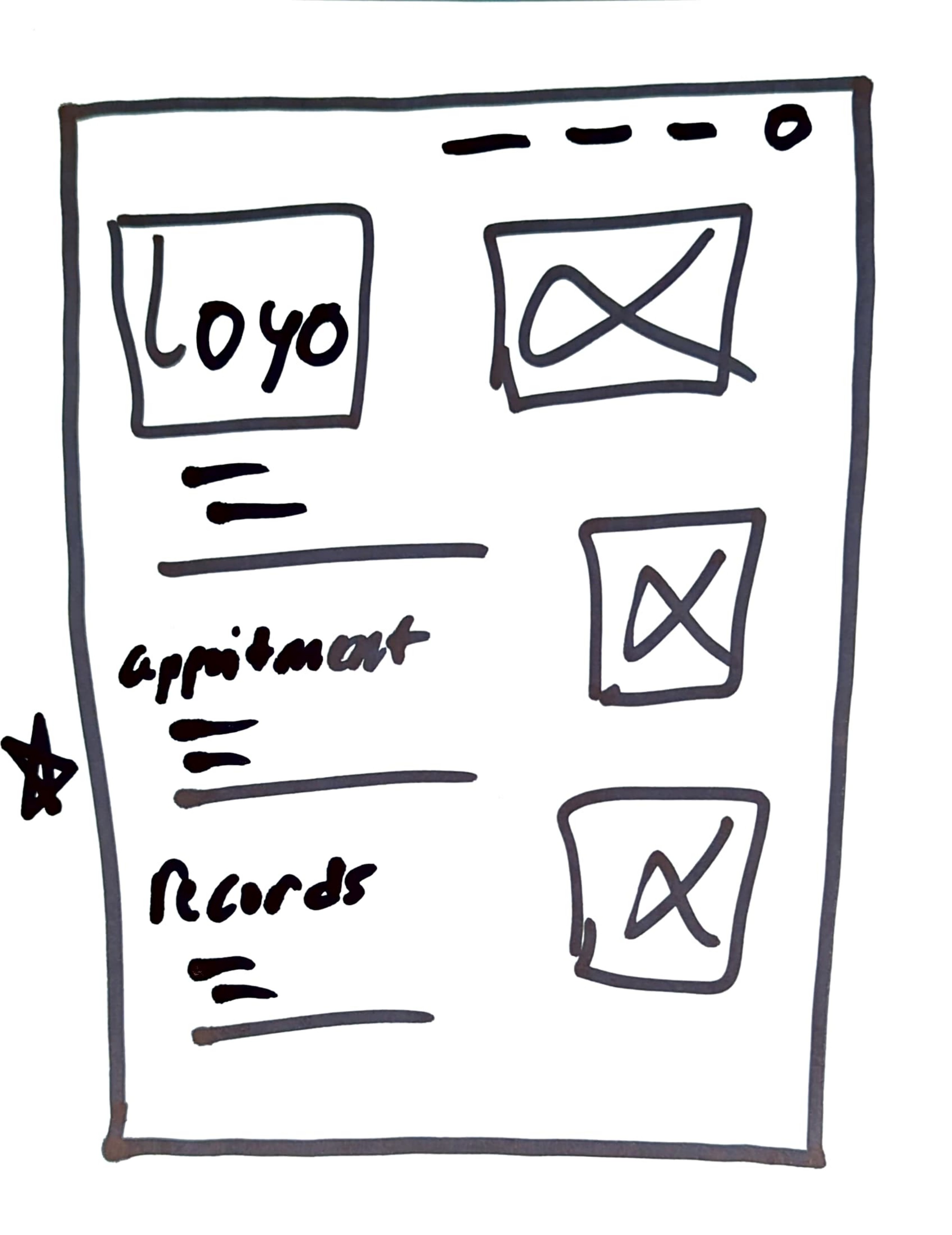
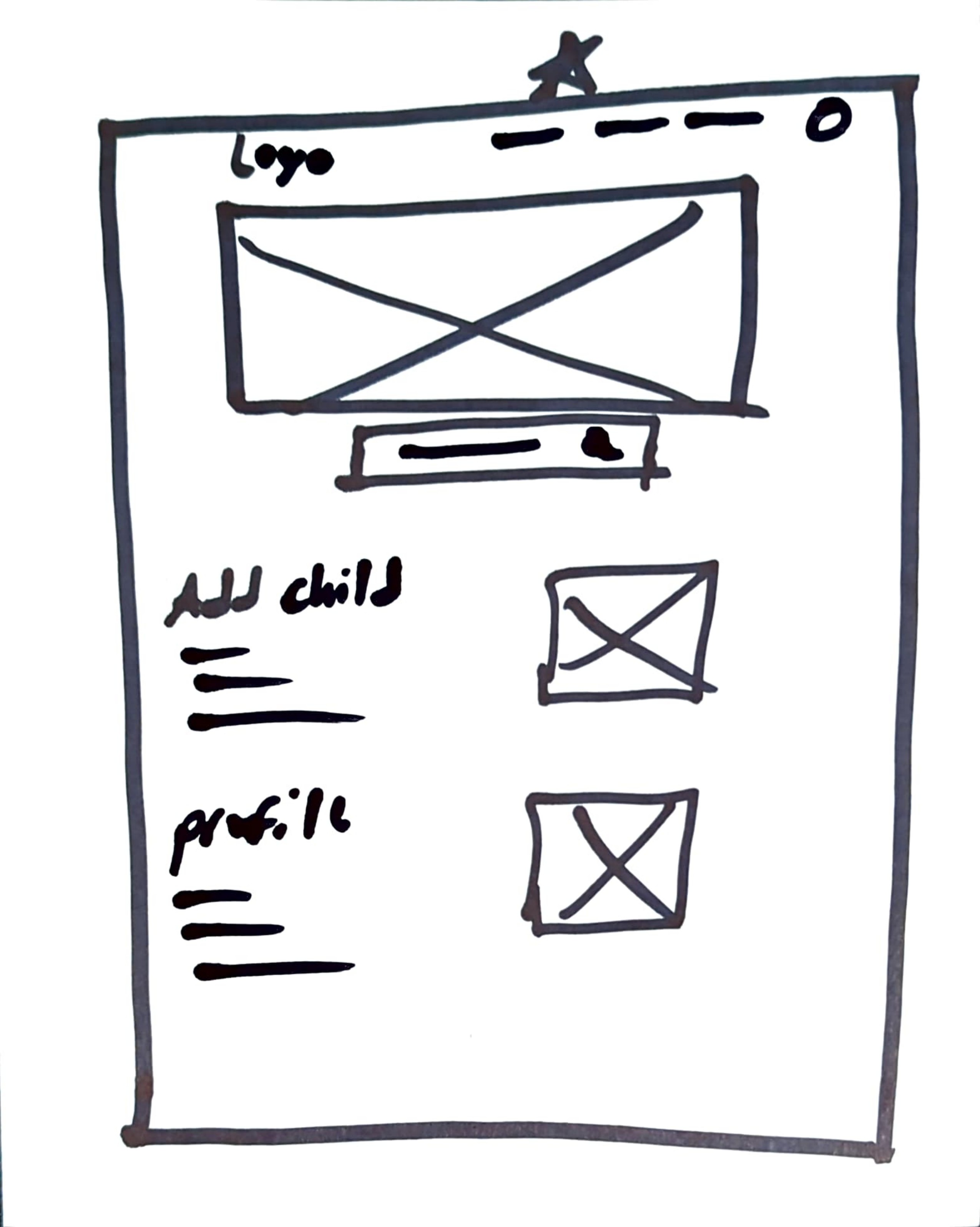
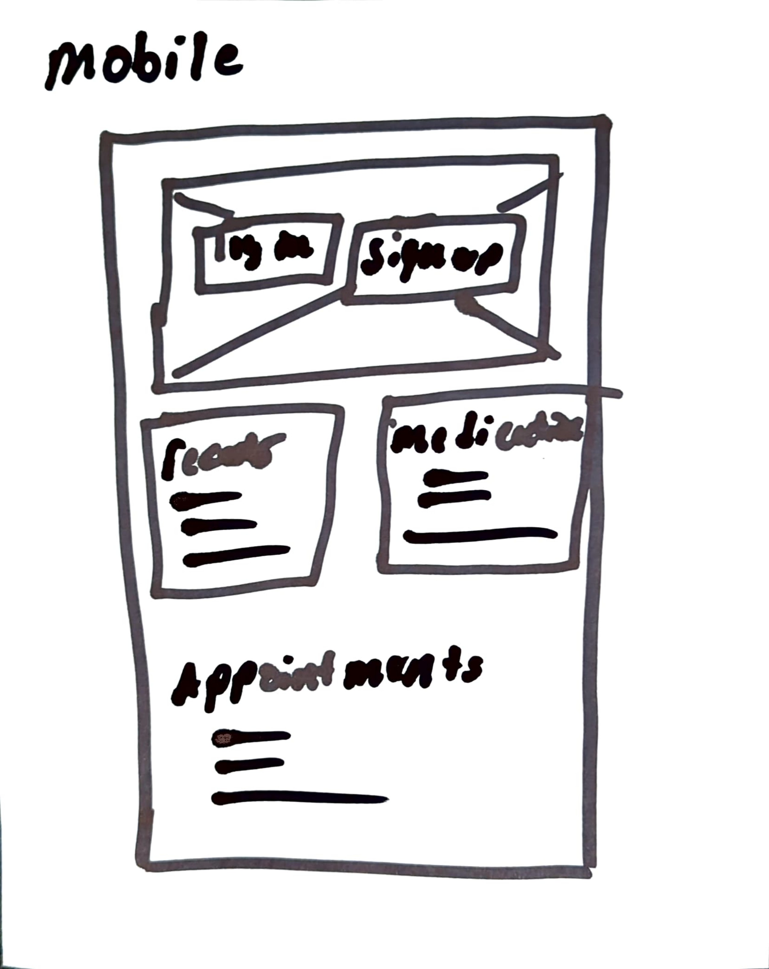
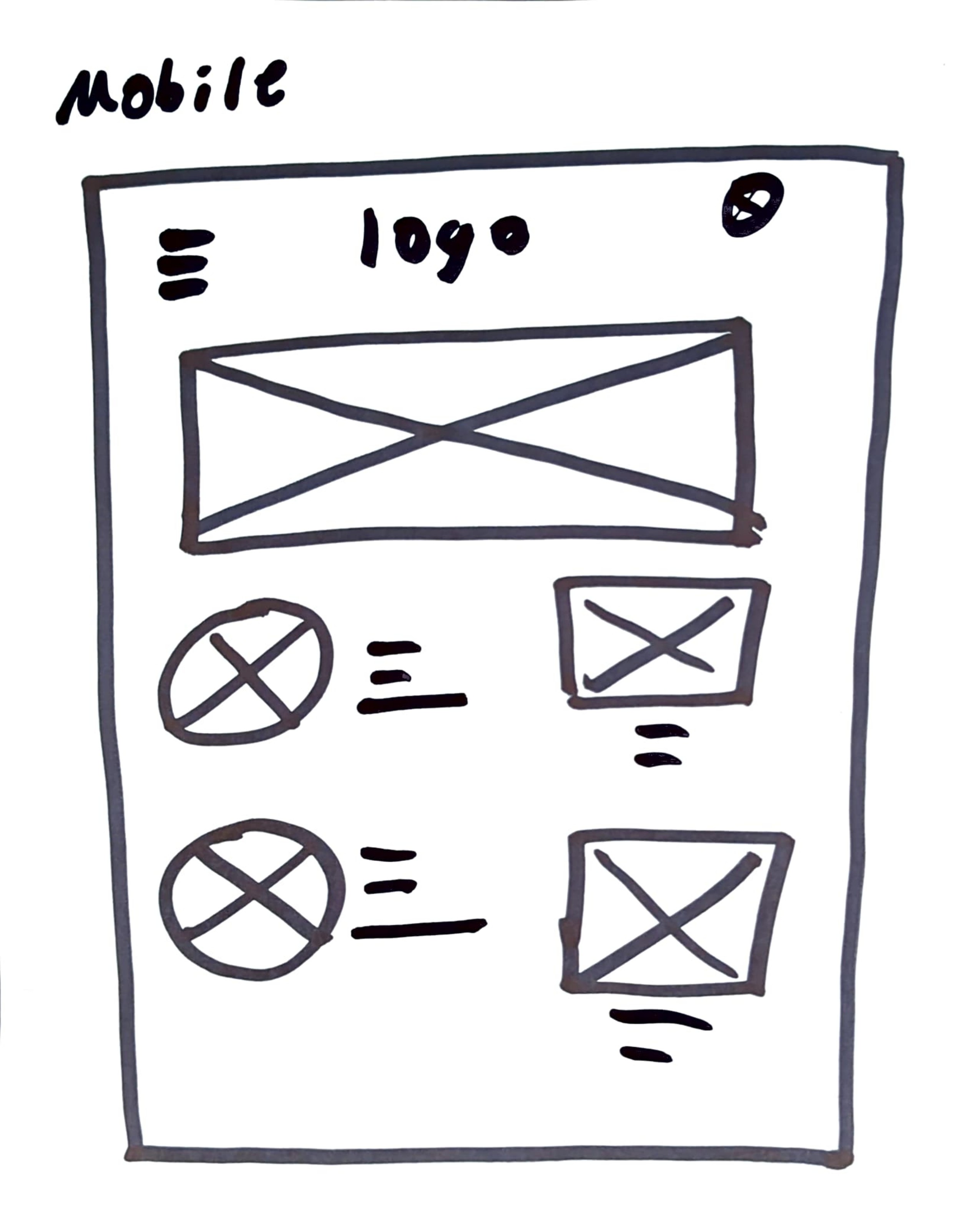
The homepage wireframes were designed with a focus on simplicity, clarity, and emotional impact. Emphasizing clean spacing and negative space, the layout creates a calm and welcoming experience for parents. Larger imagery highlights the importance of family, reinforcing the product’s family-centered purpose. While the paper wireframes are minimal, they set the foundation for a spacious and intuitive interface. The mobile wireframes carry these principles forward, prioritizing ease of use by allowing parents to quickly access, upload, and view essential documents with minimal friction